Zilliz Cloud’s Redesigned UI: A Streamlined and Intuitive User Experience
As AI continues to reshape industries, the demand for powerful, scalable technologies like vector databases capable of supporting enterprise-level GenAI applications has surged. Developers require tools that are not only robust but also intuitive, enabling them to build and maintain their AI applications quickly without unnecessary complexity.
With this in mind, we introduced the latest release of Zilliz Cloud, which comes packed with numerous enterprise-ready features and enhancements, including multi-replica, data migration, and an improved Cardinal vector search engine for a 10x performance boost. Additionally, we've rolled out a completely redesigned user interface (UI). This new UI is cleaner, more intuitive, and specifically designed to streamline workflows, reduce cognitive load, and boost productivity. It allows developers to concentrate on innovation rather than getting bogged down by intricacies.
In this blog, we'll explore the motivations for our UI overhaul, introduce the changes we've made, and discuss how this new interface can help developers work more efficiently. We'll also share insights from our experience redesigning a UI for a SaaS product, offering guidance to product designers seeking to improve user interactions in their own projects.
Check out the video below for a quick look at our brand-new UI for Zilliz Cloud.
Realigning Our Vision: The Drive for a UI Redesign
Since starting work on Zilliz Cloud in 2022, we have rapidly evolved, introducing new versions almost monthly and expanding our features to address our users’ pain points, deliver tangible benefits, and help them achieve greater success. Initially, we set ambitious user experience goals, but the fast pace of feature releases often pushed them to the background. This is a common challenge in tech companies, where the pressure to deliver continuously can overshadow foundational UX objectives.
Our Jira backlog, filled with optimization tasks, highlighted the need for a significant pause and reassessment. As the vector database market becomes increasingly competitive, maintaining a great user experience is crucial for user satisfaction and staying ahead of the competition.
This realization led to our decision to undertake a comprehensive UI redesign. This major update isn't just about enhancing aesthetics; it involves rethinking functionalities, modules, and overall usability to ensure our platform is intuitive and powerful. We aim to provide developers with a tool that is functional and a pleasure to use.
Identifying Issues through a Comprehensive UI/UX Audit
As part of our commitment to refining the user experience, we conducted a comprehensive UI&UX audit that involved a detailed review of all components, forms, and workflows within our interface. This process helped us document critical pain points and areas needing improvement, ensuring a holistic approach to the redesign effort.
During this audit, we found that many usability issues stemmed from an outdated component library that lacked flexibility and fell behind current web design trends, with popular CSS libraries like Tailwind, Radix, and shadcn/ui leading the charge toward cleaner, lighter, and more pragmatic design approaches.
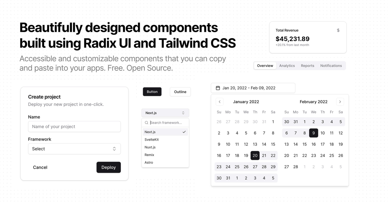
Confronting these discrepancies head-on, the design team felt a strong urgency to revamp our components. The contrast between our existing styles and these modern, streamlined designs was striking, underscoring the need for a significant update. Recognizing that patching the old library would only lead to further complications, we decided to redesign our UI component library from the ground up. This strategic move is about staying current with trends and enabling our design and front-end teams to update interfaces more efficiently, ultimately leading to a better product that resonates well with users and enhances their overall experience.
Rolling Out a Streamlined, Developer-Friendly UI Design for Better User Experience
Now that we’ve identified the driving factors behind our decision to redesign the UI and the issues we encountered, let’s look at what we’ve changed and how these changes can help our users.
A Simplified and Clear Navigation
Our previous navigation system, split between a sidebar for project-level features and a top menu for organizational tasks, presented a few key challenges:
Users often struggled to differentiate between organizational and project-level tasks.
The top-left corner was cluttered with elements with varying access frequencies, creating unnecessary noise.
Some interface elements lack functionality, which went against our goal of maintaining a clean and efficient design.
Below is a comparison of the navigation system before and after the UI redesign. To address the above challenges, we completely restructured the navigation. This included decluttering the top-left corner to reduce visual noise and removing non-functional elements to create a cleaner interface.
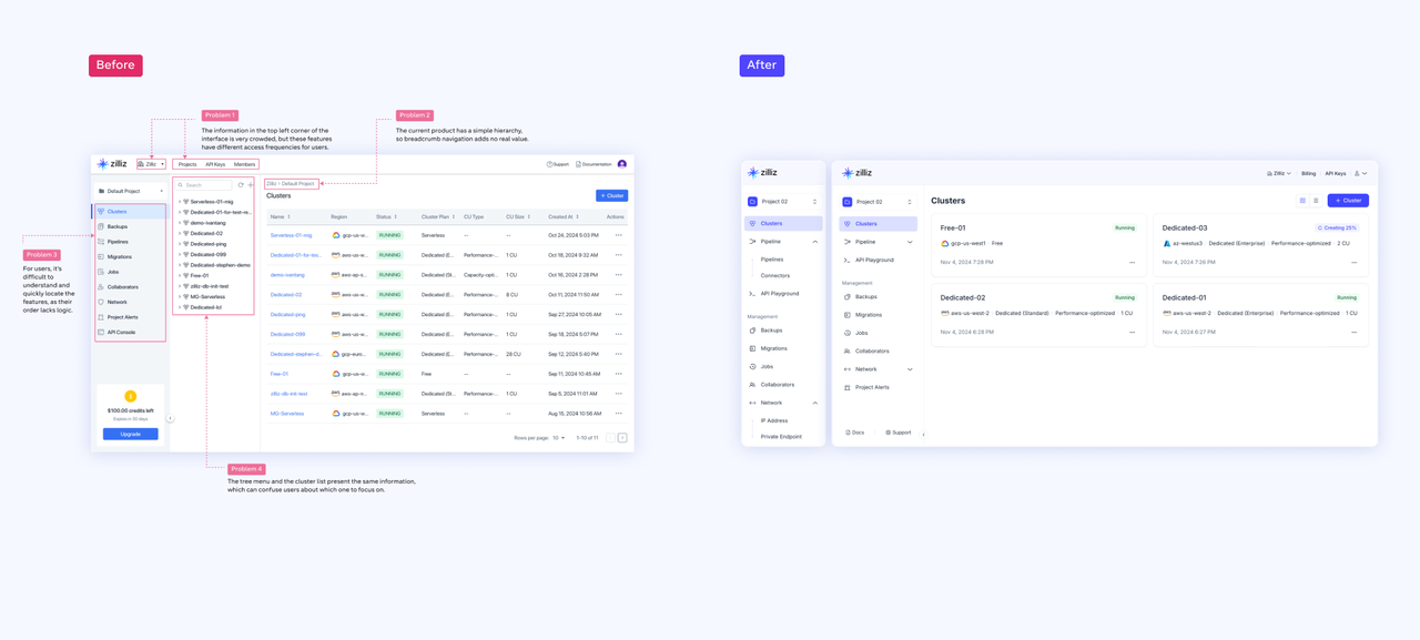 Comparison of the navigation system before and after the UI redesign.png
In addition to resolving these issues, we introduced additional improvements:
Categorized Features: Project-level features are now grouped into logical categories, making it faster and easier to locate tools and information.
Improved Sidebar Clarity: Redesigned sidebar icons offer a cleaner, more intuitive look, reducing friction in navigation.
The new system is now more organized, streamlined, and intuitive, providing a clearer, more efficient user experience.
A Modern Card-Based Design
User feedback revealed two major issues in our previous design: densely packed tables that overwhelmed users and blank pages that felt sparse, especially on larger screens. We introduced a card-based design in the new UI to tackle these extremes. This approach perfectly balances information density and simplicity, organizing content into structured, visually distinct cards.
Each card acts as a self-contained block with intuitive elements like buttons and links. This simplifies interactions and ensures that essential actions are easy to spot and perform. By grouping information logically, the cards turn complex datasets into scannable, neatly arranged units, reducing visual clutter and enhancing usability.
The outcome is a UI that’s as functional as it is visually engaging, empowering developers to stay focused on their work without distractions.
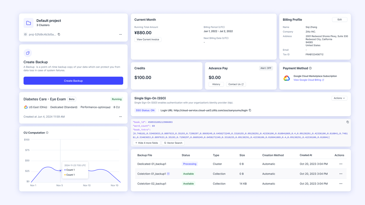 A Modern Card-Based Design
Greater Clarity with Grid-Based Consistency
To bring structure and harmony to the new UI, we’ve implemented a strict grid system that organizes every element precisely. This approach ensures perfect horizontal and vertical alignment, resulting in a clean, polished, and intuitive layout. By creating a visually consistent foundation, the grid reduces cognitive load, making it easier for users to process information effortlessly.
Beyond enhancing the user experience, this grid system streamlines our team's design process. Consistent layouts across feature pages mean designers and front-end developers can work more predictably and efficiently when creating new pages or adding features. Components are carefully sized to allow for flexible combinations, ensuring the interface stays cohesive and adaptable to different scenarios.
This focus on alignment and structure doesn’t just refine the look and feel of the platform—it also supports scalability. Developers can stay focused on building functionality without being distracted by inconsistencies, while users enjoy a functional and visually harmonious UI.
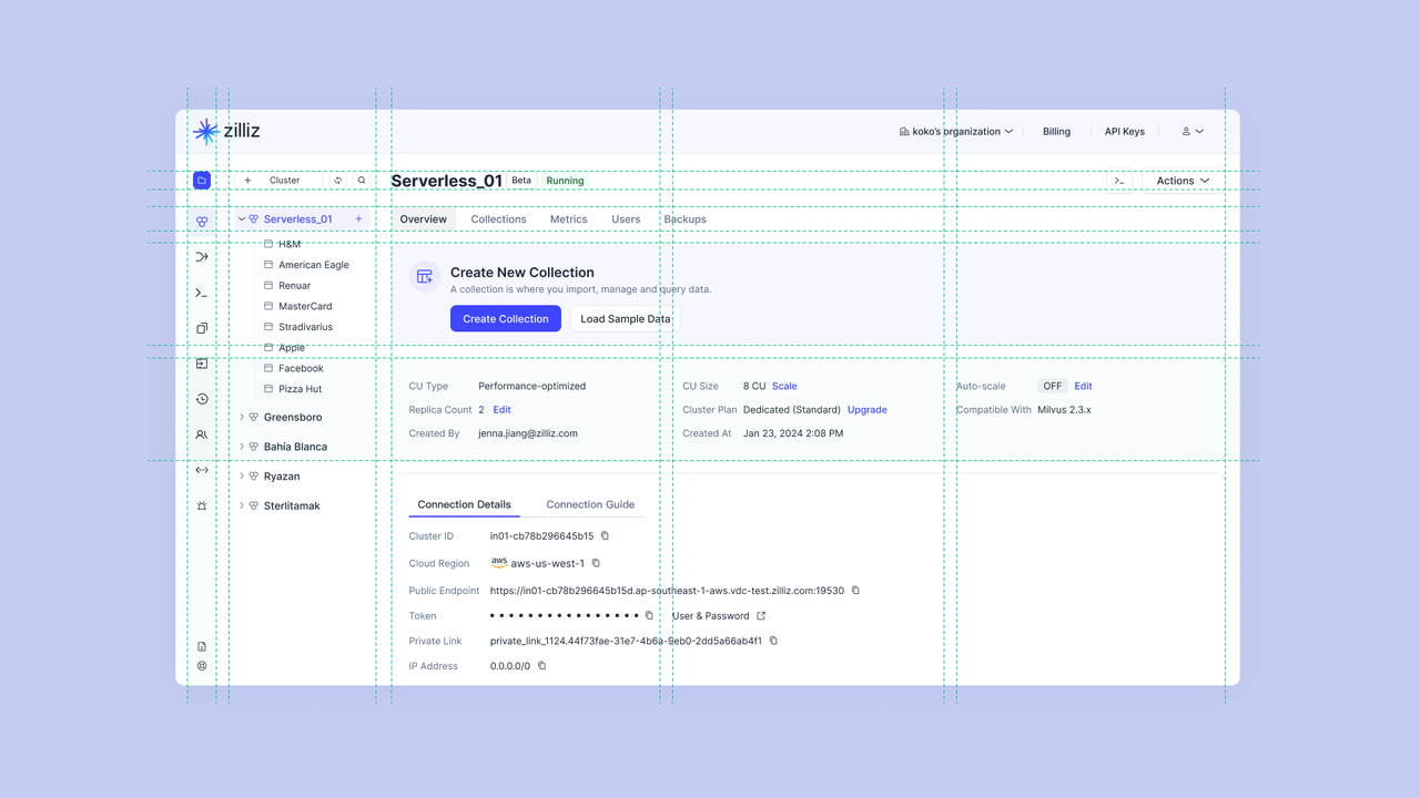 Greater Clarity with Grid-Based Consistency
A More Intuitive Interface
As our product grew and evolved, the fast-paced development often led to reusing familiar design patterns to meet tight deadlines. While this approach ensured consistency across the platform, it sometimes came at the expense of user intuition. Pages that looked cohesive didn’t always feel natural to navigate, revealing a key insight: consistency alone isn’t enough. True usability requires balancing consistency with adaptability tailoring design to prioritize the user experience.
We shifted to a more flexible approach to organizing information to make the interface more intuitive. For instance, we refined table designs to suit different object types, ensuring each table better reflects the data it displays. Similarly, we restructured dense information clusters into card-based layouts, offering clearer context and more actionable elements.
Moving away from a one-size-fits-all approach, we’re creating an interface that feels flexible and user-focused, helping developers navigate tasks more efficiently while enjoying a smoother, more intuitive experience.
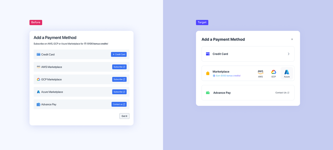 A More Intuitive Interface
Our Redesign’s Foundation: A Streamlined and Scalable UI Library
Our successful UI redesign wouldn’t have been possible without the creation of a streamlined and scalable UI library. Grounded in Atomic Design Theory, this library reimagines the core elements of design—colors, fonts, shadows, and components—into a cohesive system that ensures consistency across the platform while remaining adaptable to diverse use cases.
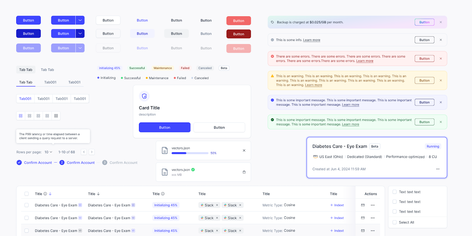 A Streamlined and Scalable UI Library
This new UI library was built with the understanding that both users and internal teams interact with the product as a unified whole, not as isolated pieces. By refining the overall look and feel and reworking components to ensure seamless integration across all interfaces, we created a system that addressed the challenges of our redesign and set the stage for a more intuitive, efficient, and future-ready product.
Below, we outline some key strategies and best practices behind our approach.
Refreshing the Color Palette for a Modern Look
The first step in optimizing the UI was refreshing the color palette to reflect a more modern and dynamic aesthetic. User feedback revealed that the previous design felt outdated, so we introduced a brighter, tech-inspired blue to replace the duller shade. Adjusting the lightness and value of other colors added a fresher, more youthful tone while reducing the reliance on dark colors and grays.
We prioritized black and white as the core colors to achieve a minimalist and balanced look, using carefully controlled proportions for contrast and harmony. Heavy contrasts were softened with subtle outlines and shadows, giving components a lighter appearance. These updates bring a polished and contemporary feel to the interface, aligning it with today’s design standards and enhancing its visual appeal.
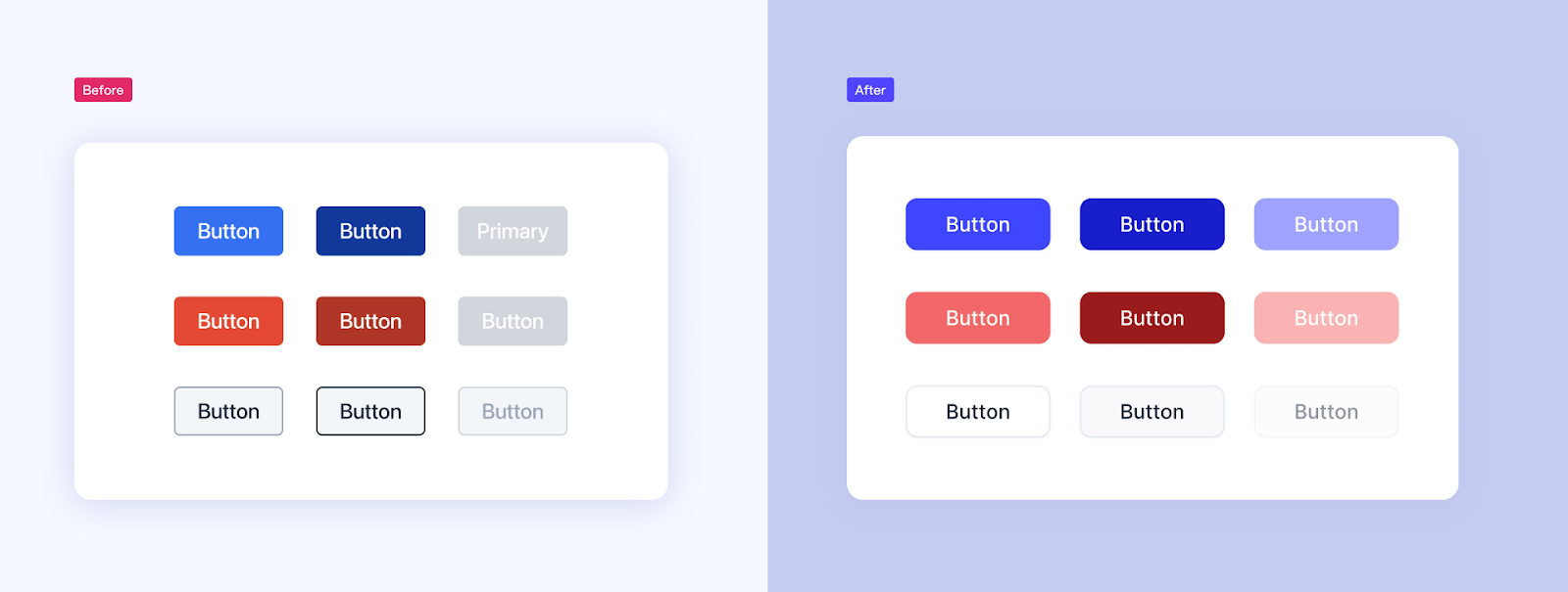 Refreshing the Color Palette for a Modern Look
Enhancing Usability with Thoughtful Use of Negative Space
Effective use of negative space, or white space, is essential for reducing clutter and creating a more comfortable, user-friendly interface. Our redesign, we incorporated generous padding across components to improve readability and usability. For instance, buttons now have a set minimum width, ensuring that shorter labels like "Edit" and "Save" remain visually balanced and easy to interact with, regardless of text length.
This deliberate use of negative space declutters the interface, making it visually inviting and intuitive to navigate. We also refined icons with slimmer, more elegant designs, adding to the sense of lightness when combined with other elements.
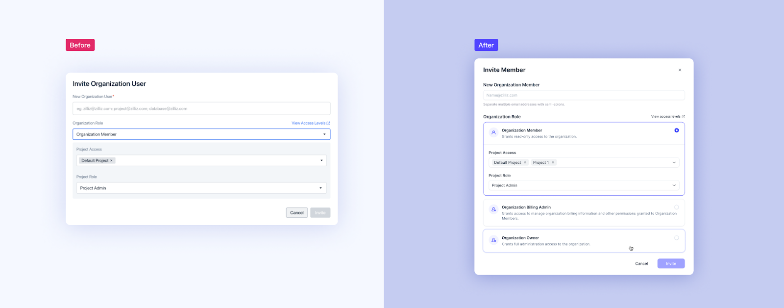 Enhancing Usability with Thoughtful Use of Negative Space
Embracing Simplicity: “Less is More”
Simplicity isn’t just a design preference—it’s a deliberate strategy. In our new UI, we embraced the principle of restraint to create a streamlined and focused design system. Icons and logos have been standardized to a single size and scaled dynamically across different contexts. This “less is more” philosophy allows us to deliver cohesive, elegant designs without adding unnecessary complexity.
We’ve simplified the system by narrowing the color palette to a select set of essential tones, using only light and dark shadows, and limiting the text hierarchy to just four levels. These deliberate constraints reduce visual clutter, make the interface easier to maintain, and enhance designers' productivity while delivering a clean and enjoyable user experience.
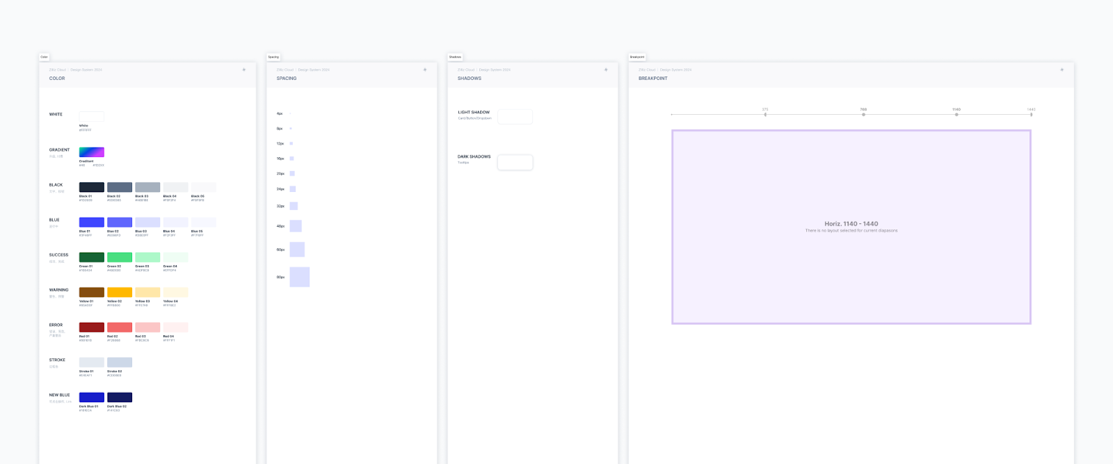 Embracing Simplicity - Less is More
Tailoring Components for Smarter, More Intuitive Forms
In design, we live by the principle that "Form follows Function." Every component in our UI library must have a clear, purposeful role. This means designing components that can support diverse user inputs and scenarios for database products. For example, as a core element of any SaaS platform, forms are essential—they're where users handle critical tasks like entering payment details, secure codes, links, passwords, and more.
We introduced variable input components designed to adapt seamlessly to different requirements to improve clarity and usability. These input fields are intuitive and visually clear, helping users complete tasks quickly and accurately. By prioritizing functionality and user efficiency, we've made even the most complex workflows feel smooth, reducing friction and ensuring the overall experience remains effortless.
 Tailoring Components for Smarter, More Intuitive Forms
Additionally, we’ve added a special type of Alert specifically for cost-related updates, making them easy to tell apart from regular system notifications. This means users can quickly recognize important alerts about charges, billing, or usage, without mixing them up with routine messages.
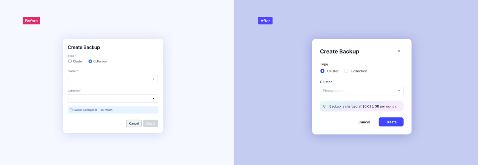 Tailoring Components for Smarter, More Intuitive Forms 2
Defining Clear and Consistent Design Guidelines
A great component library isn’t just about fixing style inconsistencies—it’s about simplifying workflows and fostering better collaboration between designers and developers. Previously, unclear guidelines for using components often caused confusion and friction during design reviews and development. We introduced clear, practical rules to overcome these challenges that eliminate ambiguity, resolve technical debt, and reduce unnecessary back-and-forth. These rules allow teams to spend less time debating details and more time focusing on meaningful tasks, resulting in consistent and efficient design deliverables.
Here are the key rules we’ve established:
Button Width: All buttons now have a minimum width to ensure they remain usable and easy to click, regardless of the label length.
Primary vs. Secondary Buttons: Primary buttons are always at least as wide as secondary buttons, even if the latter have longer text, maintaining visual balance.
Form Indicators and Hints: Required field indicators and form hints follow strict placement rules, making forms more intuitive and accessible.
Modal Window Sizing: Modal windows are limited to four predefined widths, giving designers flexibility while preserving visual consistency.
These guidelines go beyond efficiency—they lay the groundwork for a polished, cohesive experience that feels natural and intuitive for users.
What Made This Redesign Possible
Team Alignment: A Shared Vision
Redesigning a platform is no small task—it’s a complex, large-scale effort that can feel overwhelming for designers and developers. To navigate this complexity, our top priority was aligning the team. While starting with a clear vision is crucial, staying aligned on the destination is even more important. From the outset, we moved away from individual assumptions or personal preferences and adopted a deliberate, collaborative approach. Every design decision was evaluated carefully to ensure it served our user experience goals, and every modification was reviewed to ensure it added meaningful value to the product. This shared focus kept the team cohesive and on track throughout the process.
Agile Steps and Smart Task Management
Balancing a large-scale redesign alongside ongoing feature development required a strategic and agile workflow. We broke the project into manageable phases, prioritizing clear communication and efficient task management to ensure progress without disrupting regular product iteration.
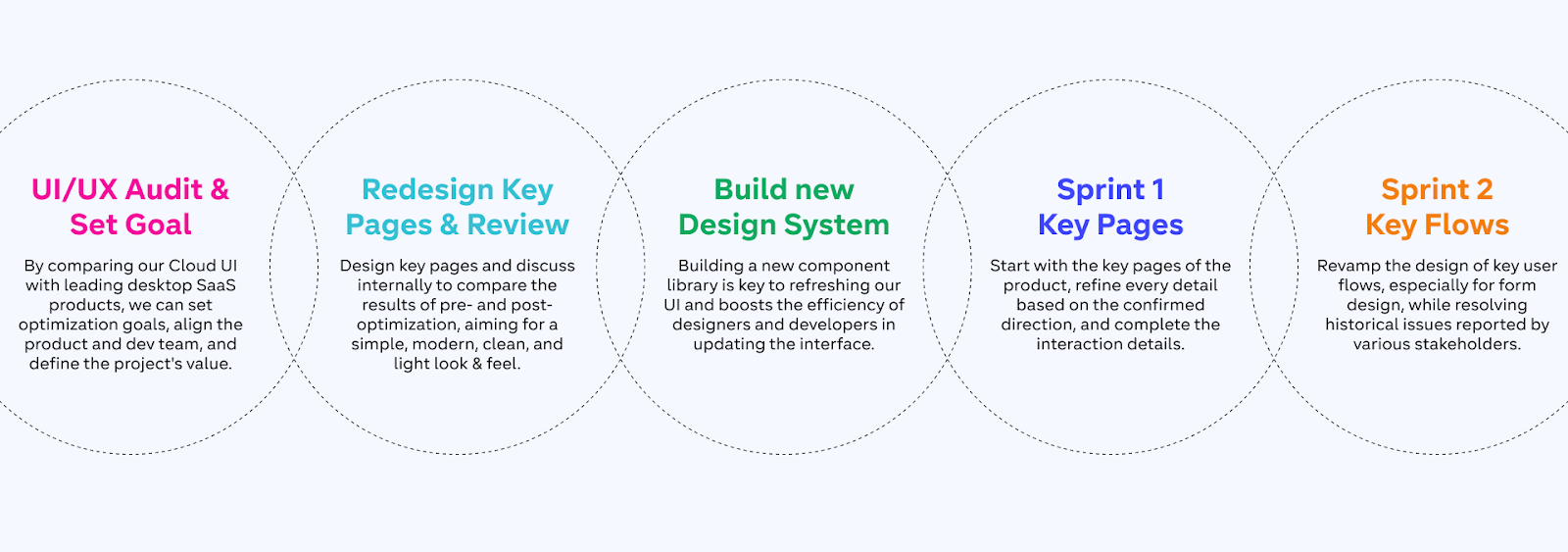 Agile Steps and Smart Task Management
One pivotal moment was the Agile UI Implementation Review, where we spent a day carefully checking how closely the newly implemented UI matched the original design plans. This review identified over 300 inconsistencies, which we documented in a Smartsheet on Lark. Each issue was tagged with actionable statuses such as Unresolved, Resolved, To Be Verified, and Verified and assigned to specific team members. This structured process enabled us to resolve and validate all issues within a week, ensuring the new UI met our quality and consistency standards.
Learning from the Best: SaaS Design Beyond Databases
Traditional database products often struggle with usability, weighed down by complex feature sets that can overwhelm users. With our redesign, we set out to look beyond the conventions of database-specific UI/UX. Rather than limiting our perspective to competitors, we broadened our approach to embrace the best practices found in modern SaaS design.
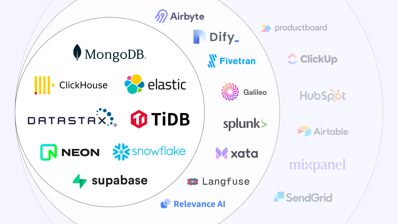 Learning from the Best - SaaS Design Beyond Databases
Our research went beyond the database industry, exploring interfaces from fields like data processing, cloud services, AI applications, and other leading SaaS platforms. This broad perspective gave us invaluable insights into innovative solutions and common patterns that work across industries.
One Last Thing
This redesign was a true team effort, made possible by the close collaboration between designers, engineers, and many other teams. Their hard work, creativity, and dedication have elevated the Zilliz Cloud experience to an entirely new level, and we’re incredibly grateful for the passion and commitment each team member brought to this project.
Our mission doesn’t stop here—we’re committed to continually refining Zilliz Cloud and staying attuned to our users’ needs. We invite you to explore the updated UI and experience the improvements firsthand. Your feedback and suggestions are invaluable to us, so please don’t hesitate to share your thoughts. Together, we can keep making Zilliz Cloud better for everyone!
Start for free with all the new features and enhancements of Zilliz Cloud!
Explore with our free tier (no credit card required), or try our 30-day enterprise trial with up to $200 in credits.
Subscribe through any cloud marketplace and receive an additional $100 credit.
For more detailed information about Zilliz Cloud, visit our documentation.
Further Reading
Keep Reading
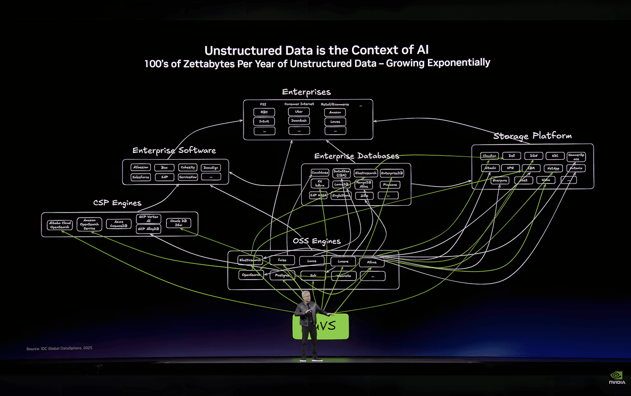
How Zilliz Ended Up at the Center of NVIDIA’s Unstructured Data Story at GTC 2026
If unstructured data is the context of AI, then the ceiling of AI applications will be set not just by models, but by how mature the infrastructure for unstructured data becomes.
Will Amazon S3 Vectors Kill Vector Databases—or Save Them?
AWS S3 Vectors aims for 90% cost savings for vector storage. But will it kill vectordbs like Milvus? A deep dive into costs, limits, and the future of tiered storage.

Empowering Innovation: Highlights from the Women in AI RAG Hackathon
On January 25, 2025, the inaugural Women in AI RAG Hackathon brought together a diverse group of women technologists at Stanford University
